saher ahmed
Menu
Close


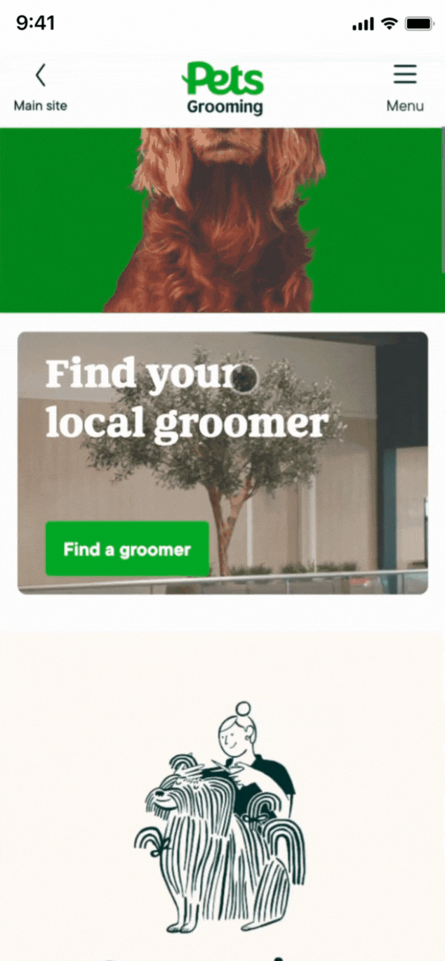
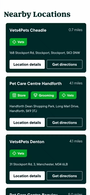
A glimpse at the final V3 screens after AB testing, showcasing improved flows and usability.
BACKGROUND
Why is booking a grooming appointment this confusing?
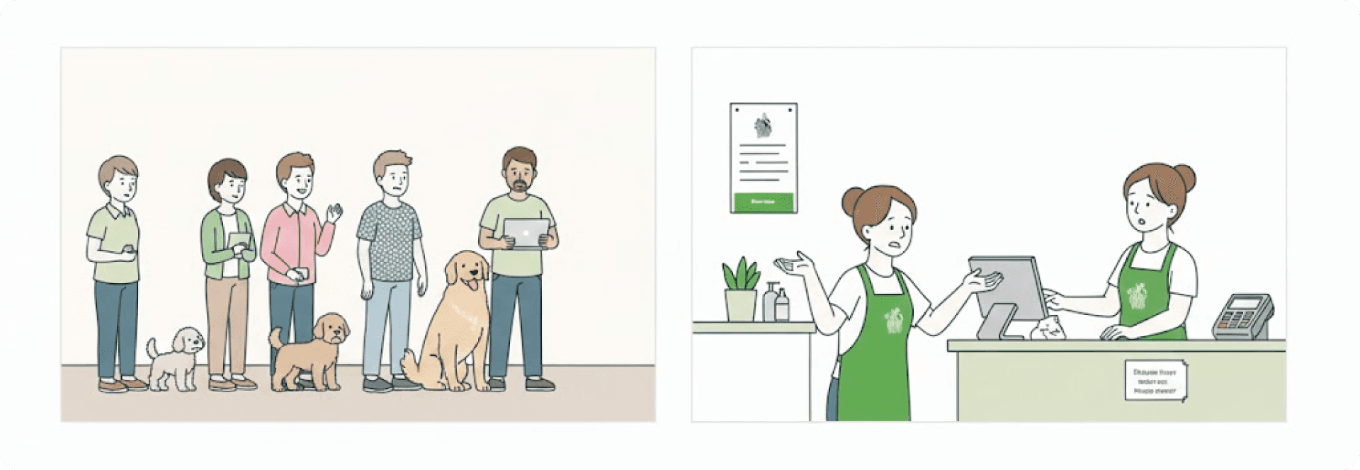
Post-COVID, pet owners faced major issues booking grooming services. Online, pricing was confusing, store info was buried, and defining a pet’s size felt like guesswork.
"I have a cockapoo. Is that 'medium' or 'small'? How much will it actually cost?"
"I can’t figure out which salon does what service, or how much it’ll set me back."
"Why do I have to call three places just to get a clear price?"
What should have been a simple, friendly in-store experience became a frustrating digital maze.
USER RESEARCH
Listening to pet parents anD THE BOTTLENECKS
Users faced three major bottlenecks in the grooming booking experience:
Anxiety around unclear pricing
Difficulty finding relevant information and
Confusion over ambiguous pet size categories
THE STRATEGIC CHALLENGE
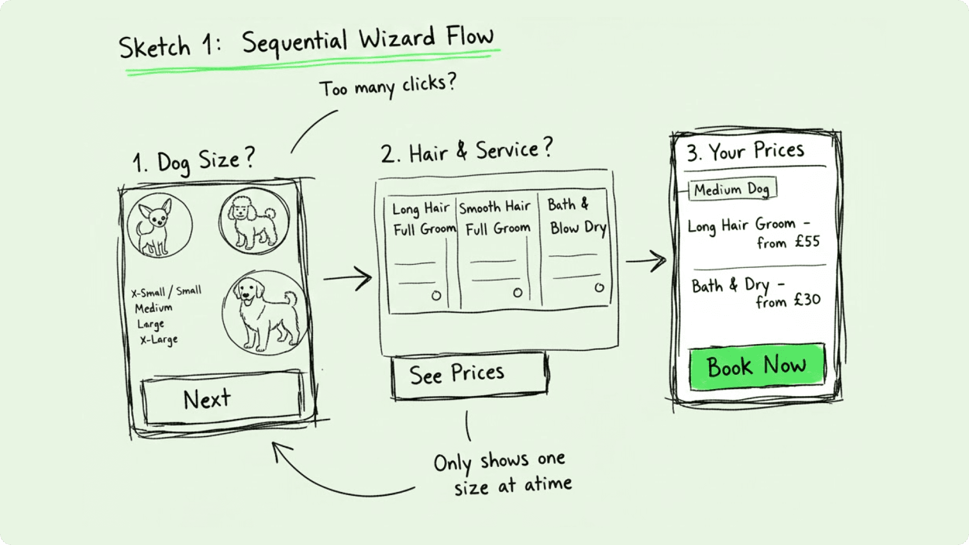
Based on feedback for Option A, we moved on to Option B.
The thought behind this approach was to prioritise completeness and transparency by displaying all possible service and pricing permutations in a single, overarching view.
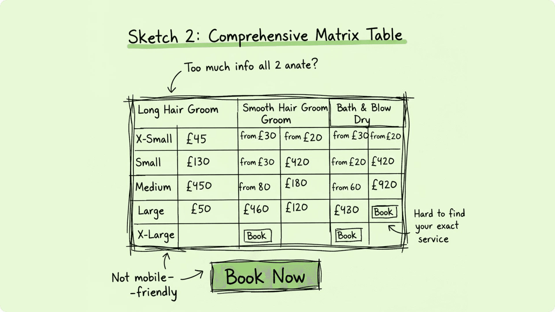
Despite its initial appeal for comprehensive transparency, the "Comprehensive Matrix Table" was strategically deemed too complex and user-unfriendly, particularly for the modern web and mobile-first users.
UPDATED HYPOTHESIS
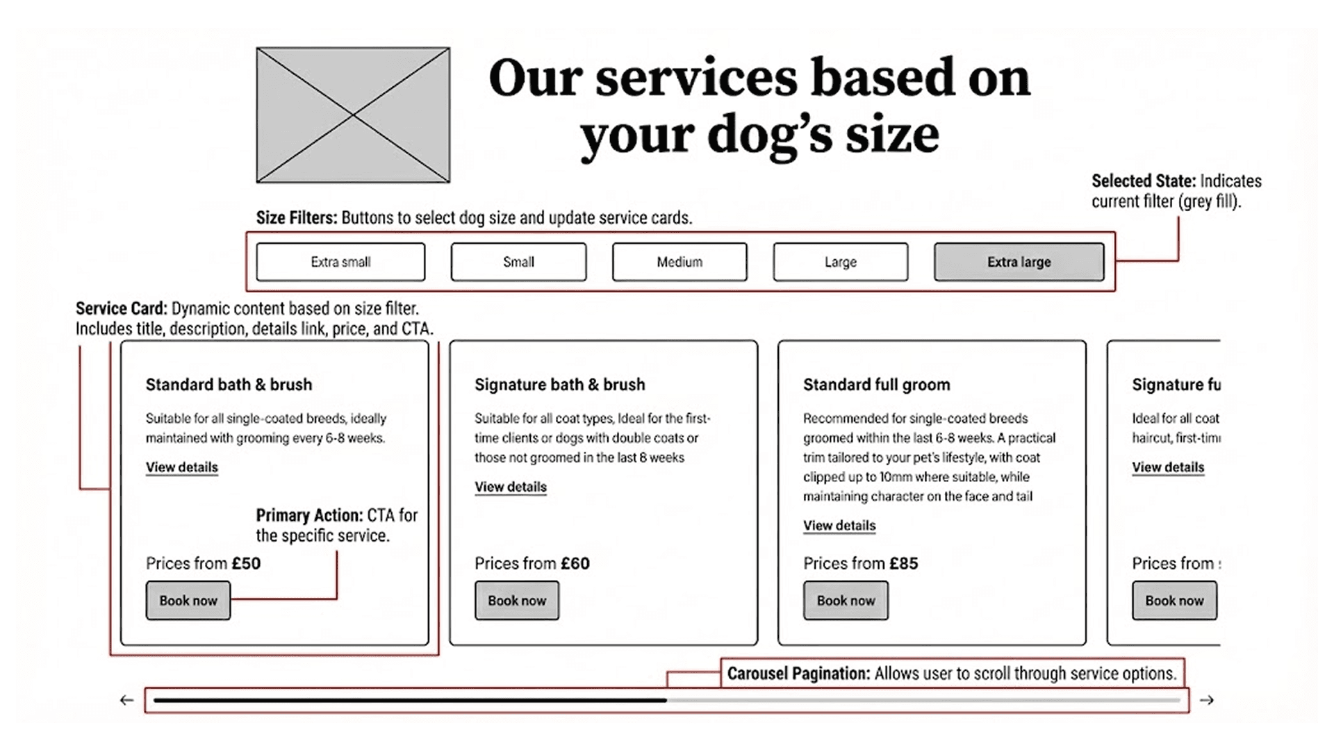
The Tabbed "Card Catalyst" (The Winning Concept)
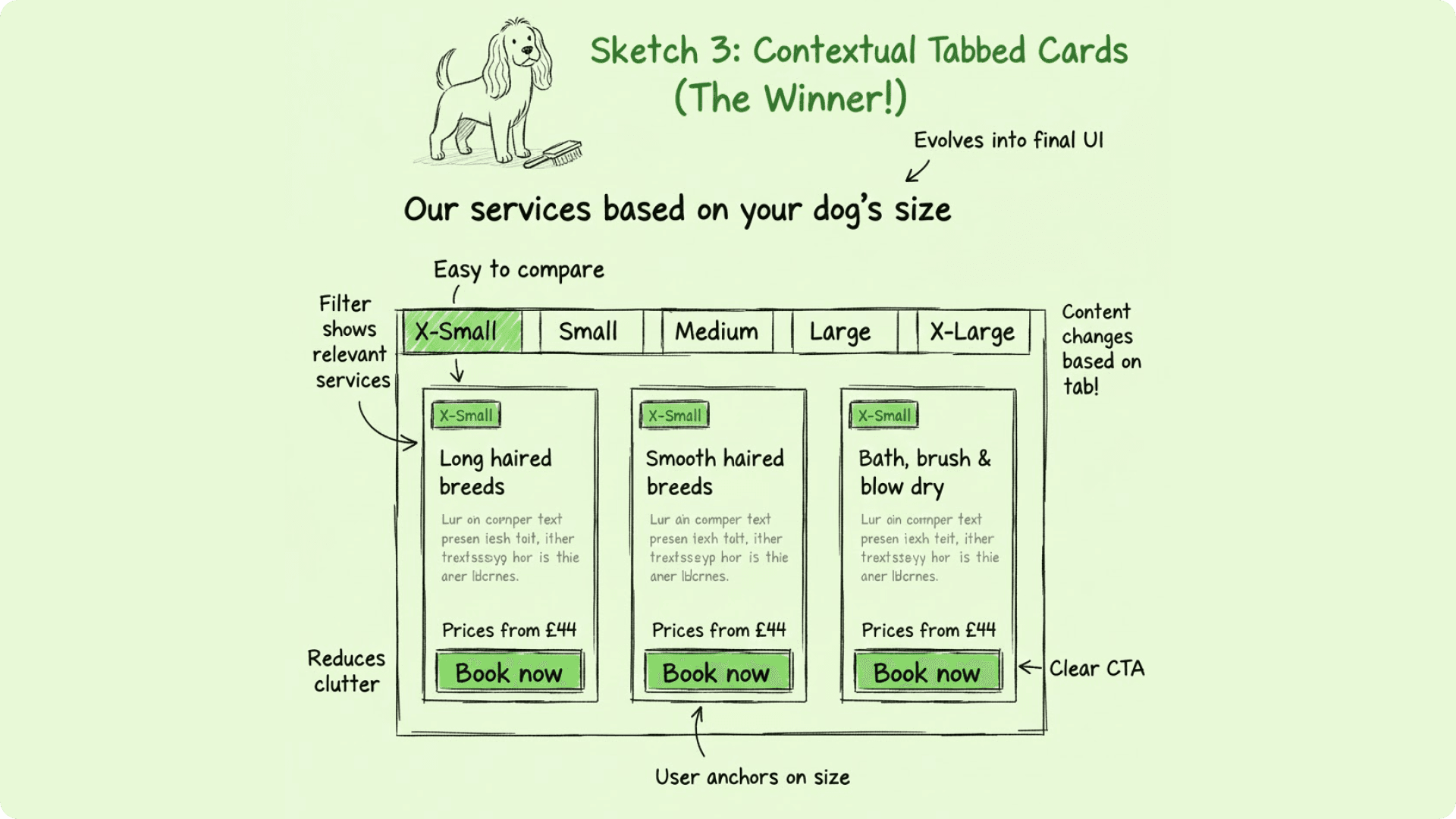
Why this won:
It balances guidance with browsing freedom. It immediately reduces cognitive load by hiding irrelevant sizes, but allows easy comparison of services within that size category.
This solution allows the user to filter by their primary concern (dog size) and then display all relevant service options in a clear, comparable format for that size.
Design Approach
Framing the problem, shaping the solution
The solution streamlined the entire flow by clarifying pricing, surfacing store-specific details and guiding users to the right service effortlessly. The result transformed online booking from a confusing chore into a seamless experience that mirrors clarity.
Feature 1:
Pooch Size Selector
A visual tool that helps users quickly identify their pet’s size category, reducing confusion and ensuring accurate pricing.
Feature 2:
Dynamic Store Cards & Locator
Updated store cards allow users to compare multiple locations at a glance and choose the most convenient option.
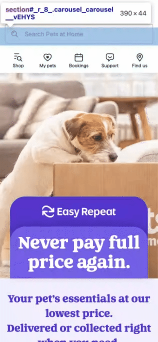
Feature 3:
CONVERSION NUDGES
Easy Repeat highlights recurring pet essentials with clear pricing and savings prompts, encouraging users to subscribe for regular deliveries or Click & Collect.
Results & Metrics
Clearer flows, happier users, measurable wins
The redesign led to tangible improvements across the booking journey since it allows the user to filter by their primary concern (dog size) and then display all relevant service options in a clear, comparable format for that size.
Booking completions increased by 42%, while overall conversion rates rose by 55%.
Users spent less time navigating the flow, with average booking time dropping from 6.5 minutes to 2.8 minutes, and support calls related to pricing and store confusion fell by 40%.

Reflection
Small tweaks, big lessons
This redesign reinforced the impact of empathy-driven design and attention to detail, where small improvements like clearer size categories and upfront pricing boosted user confidence and booking completion. I learned to balance brand consistency with functional clarity across locations and aim to deliver predictive, personalised features for a more intuitive grooming and booking experience.